Sunday, May 17, 2009

Branding/Web/Social Networking : Okoa Jewelry : Non-Profit

Recently, I have been volunteering my time for a local non-profit called Trade Justice Mission. The organization provides meaningful employment to vulnerable women in developing countries. Trade Justice Mission started Okoa, a line of fair trade jewelry, to help these women.

Trade Justice Mission will form cooperatives of women that produce hand-crafted jewelry. Okoa will then market their products and return 100% of the profits to the women.

My work with them has included: design of an e-commerce website, content direction and strategy development for their web presence.

Below are some content suggestions:
• Sell the idea that the consumer is making a difference for these women. For instance, you could use headlines or subheads like these: Jewelry done right, Ethical ear rings, Changing outfits changing lives, You can make a difference or Fashion that feels good
• The jewelry collection names could reflect the country, region, city or culture of where its from. This will help the customer realize the actual impact they are making by connecting the product with the people.
• When ever you describe the jewelry we should remind the audience that its fair trade.

Okoa's Website:
Below are some pages that are still in progress. I want Okoa's mission to come across quickly, so at the top I created a slide show series of three images that display women the organization supports. Jewelry will also be emphasized in the blue box on the front page. It will allow consumers to sift through featured products.

The site will be programmed in Cushy CMS, a content management system, and Shopify, a hosted e-commerce site, that will allow this non-profit to edit most of the content on their site when finished.


Okoa's Social Networks:
I have encouraged them to bring on a social networking intern who will:
• Use Twitter to promote products, events and create awareness for social justice.
• Use Facebook to create awareness for Okoa, fair trade and social justice. Video posts of the women they support will be used to connect their audience with their cause. It allow them to see how their purchase will effect these women. Using Facebook will also allow them to build a community around their cause, promote products and cross promote their Twitter account or blog.

Twitter


Facebook

Branding : W. W. Williams : Automotive & Transportation

PROBLEM: The branding materials of W. W. Williams, one of the nation’s largest industrial distribution, repair and service companies, were not separating the company from its competition.
• Quality service, a key characteristic of W. W. Williams, was not communicated in any of their marketing materials
• Advertising consisted of promotional offers and staged pictures of mechanics in front of large engines
• Website was inconsistent and listed only basic services

SOLUTION: The solution was to communicate a message of quality service done right the first time.
• “Consider it done” became the central theme — highlighting their message of service done right
• I set up a documentary-style photo shoot in Savannah, GA and Columbus, OH that captured workers in real life situations —
which visually separated Williams from its competition
• With polished photographs in hand, I enhanced their visual imagery with brushed metal and bolts. This detailing I then applied
to their entire line of branding materials: advertising, website and corporate brochure

Williams Corporate Brochure:


Williams Website : See more


Williams Advertising Campaign:

Branding : Nationwide Childrens Hospital Teaser Campaign : Healthcare

This is a proposed teaser campaign to recruit new physicians. The idea was to use these great quotes from existing Children’s doctors to peak the interest of potential physicians to go to the website, thinkbignationwide.com.

Branding : Advantage Bank : Financial Services

PROBLEM: Advantage Bank’s audience perceived them only as a commercial real estate lender. Their services, however, included a wide range of options: checking accounts, savings accounts and also home mortgages.

SOLUTION: The solution was to define Advantage Bank’s brand by creating a graphic standards manual as well as branding materials.
• The manual defined their brand essence, logo usage, typography, color palette and three categories of photography
(lifestyle, products and community)
• It was then used by the branch managers to give a cohesive message and look to each banking office
• Finally, I redesigned their branding materials for the banking offices: brochures, posters and outdoor banners.
Lifestyle imagery was used to emphasize the bank’s services that previously went unnoticed by Advantage Bank’s customers

Advantage Bank Graphic Standards Manual:


COLLATERAL:

Tuesday, May 12, 2009

Logo : Miscellaneous

AdFed : Logo for a non-profit group connected with AdFed


Creative Living : Logo for a non-profit group that assists adults in wheelchairs


United Community : Logo for a regional bank


Logo : Buckeye Power : Utility Provider

I created these logos for Buckeye Power. Which is an electric energy provider.
They were starting a program called Cool Conservation. The purpose of the program
was to control energy usage, and costs, when demand for electricity is at its highest.

Logo : The City of Columbus : Government

The City of Columbus came to my firm and asked for some help with an environmental logo. They wanted to start a city-wide program to raise awareness for environmental issues.

Advertising : M/I Homes Billboard Series : Real Estate

This is a proposed outdoor campaign for M/I Homes, a home builder. Each billboard
concentrated on different aspects of their new Be Confident Commitment Program.

Advertising : Nationwide Childrens Hospital U. S. News Recognition Ad : Healthcare

Nationwide Children's Hospital came to us with a reason to celebrate. Their Research Institute finished in the top five ranking in U.S. News and World Report’s best Research Departments.

My solution was to visually symbolize who accomplished this goal, the staff, by using real Children's Hospital staff badges in the shape of a five.

Sunday, May 10, 2009

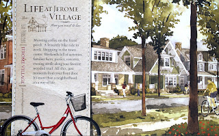
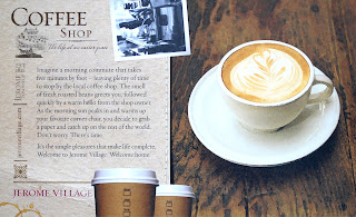
Collateral : Jerome Village Postcard Series : Real Estate

This is a postcard series for Jerome Village, a smart growth real estate development. It won an Adfed Addy Award.


About Me

About Me

Twitter Updates

    follow me on Twitter

    Reasons to Hire Me

    Three reasons you should consider me for a job:

    1. Problem Solver
    What I love most about the design process is solving problems: figuring out who a client "really" is, and not just who they say they are. I get excited about finding creative solutions to challenging problems; I appreciate good ideas regardless of application. These are several reasons why I love what I do.


    2. Experience
    I have ten years' experience working at an agency, designing everything from branding materials to advertising campaigns to websites to logos and annual reports.


    3. Attitude
    Or should I say the lack thereof,
    I enjoy working in collaborative
    creative teams. In my previous
    agency experience, I've learned
    that original ideas are purely
    starting points. Working together
    to evolve an idea makes it stronger.

    My Resume